Fintual: There’s No Design Without A System
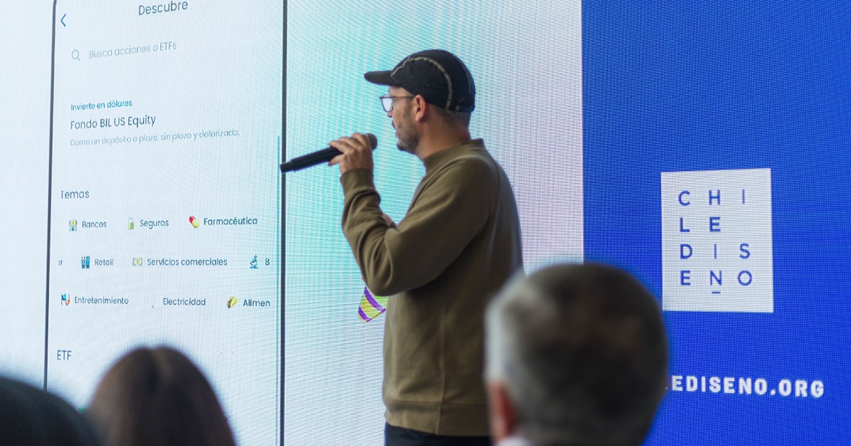
[Ignacio] Hi. I appreciate the opportunity to share with you today. Today, we will talk about the Fintual design system, and we will explain why there is no design without a system.
My name is Ignacio, I am a designer with three years of experience in digital products. Three years ago, I joined Fintual, a start-up that had 20 people at the time. Now, that number has risen to 180.
[Martin] Hi, I’m Martin. I am a designer and programmer, I’m kind of in the middle of both facets. About five years ago, I founded the design studio Design Systems International together with my partner Rune Madsen, who is based in Denmark.
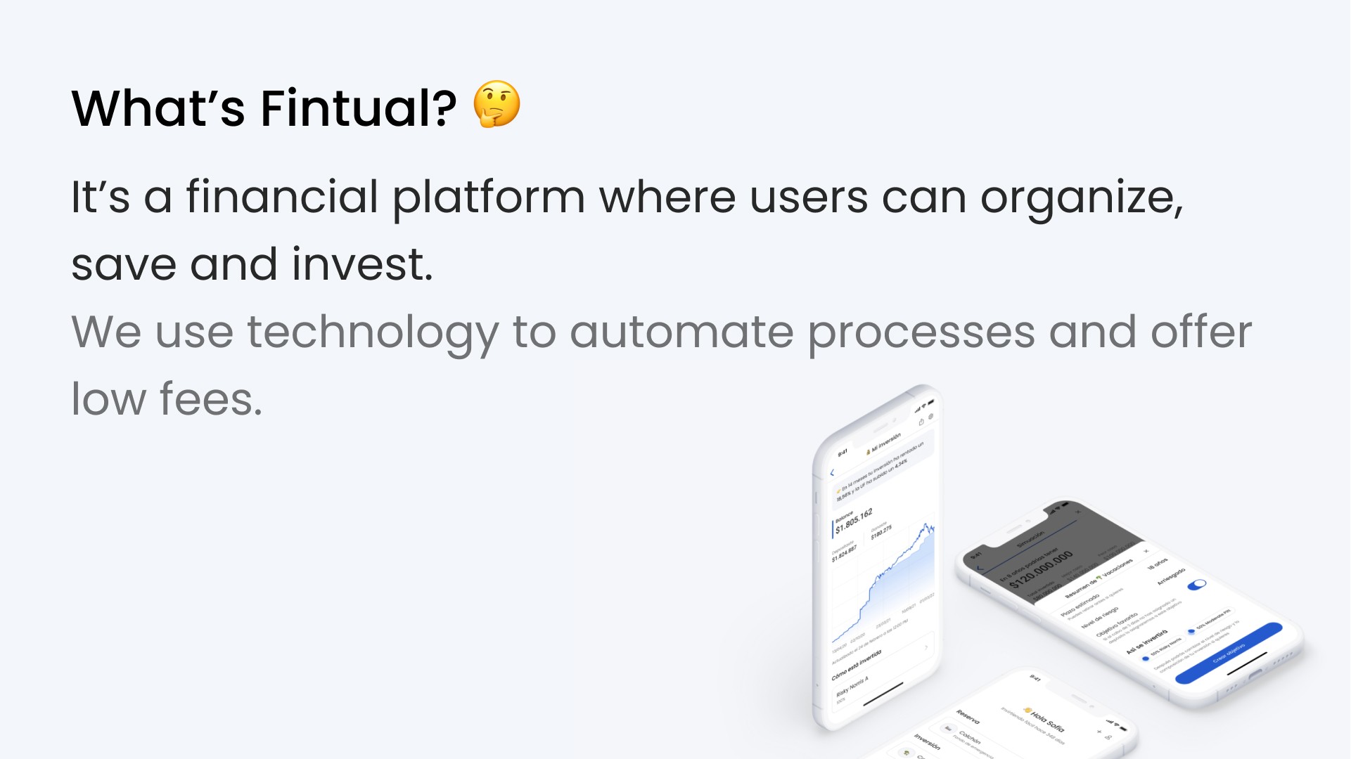
[Ignacio] Before I can get to Fintual’s design system, I should explain to you what Fintual is. Some of you may already be familiar with our platform, but for those who aren't, let me explain: we are an app and website that allows users to organize, save and invest their money efficiently. In just five minutes, one can create an account, with no minimum amount and only a photo ID. Then, you tell us your financial goals, whether it's buying a house, a car, saving for retirement, or just saving. From there, we build an optimal portfolio to ensure your money grows effectively.
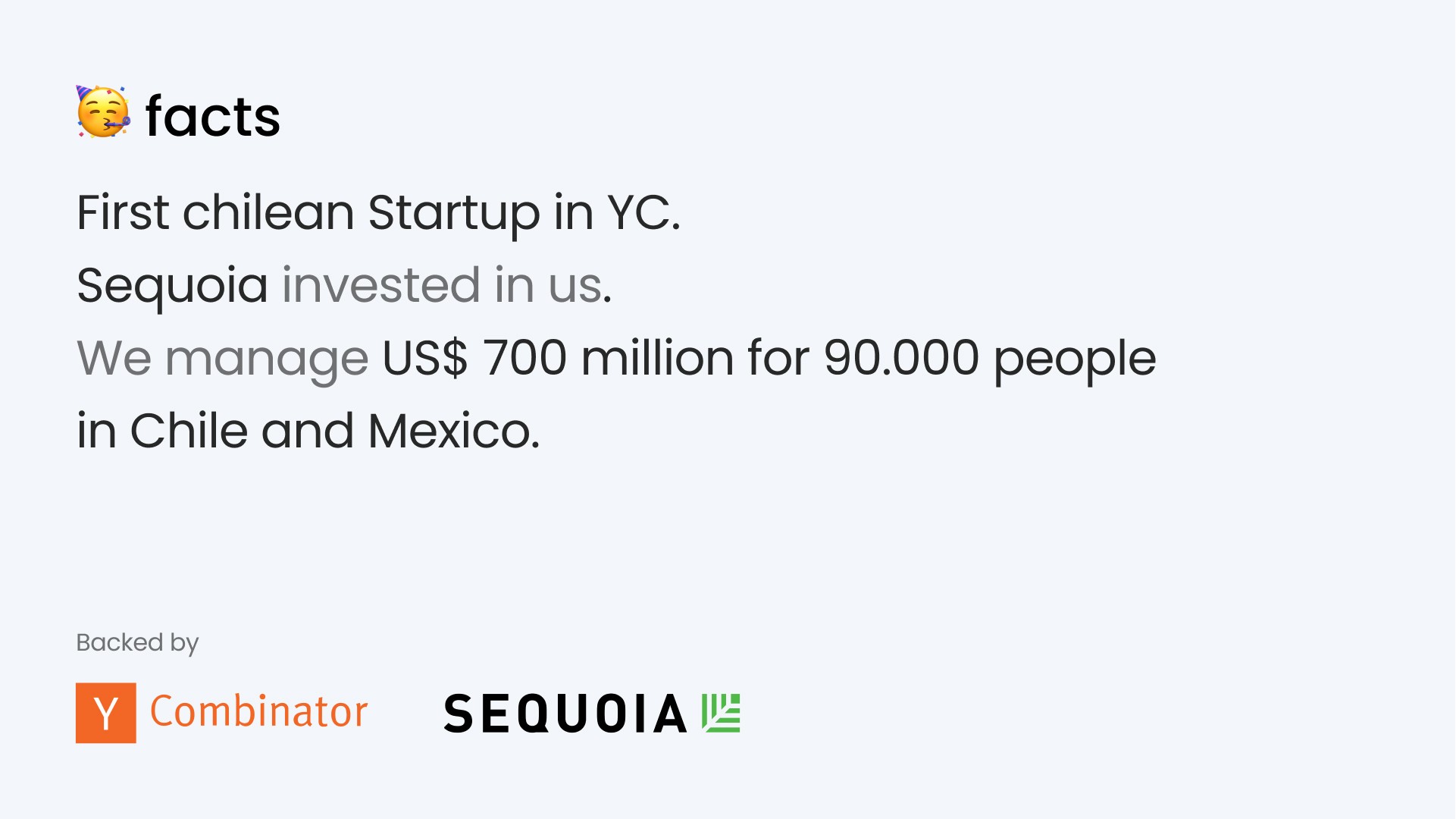
Our model has been recognized and supported by leading incubators such as Y Combinator and backed by Sequoia Capital, who have invested in giants such as Apple. We are proud to mention that we currently manage more than 700 million dollars for 90,000 people in Chile and Mexico.
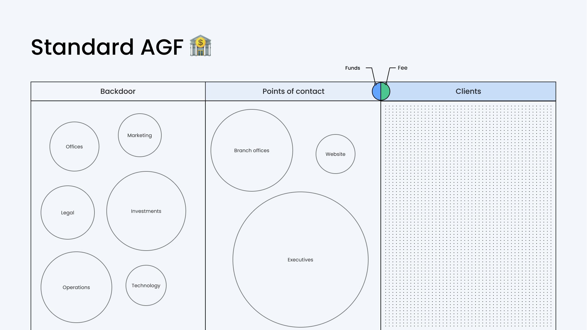
To understand our approach, it is crucial to consider the background. Conventional general fund managers, particularly in Chile (and also Mexico to a similar extent), have internal operations separate from customer contact points. The latter are usually executives who serve in branches or via telephone. In the digital age, some institutions have begun to offer websites or applications so that clients can access their investments. The basic relationship is that these managers manage your money and, in return, charge a commission.
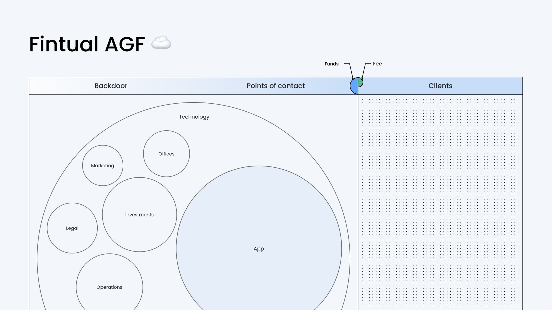
At Fintual we decided to reinvent this scheme. We eliminate the barrier between internal operations and the customer contact point. At our company, everyone interacts directly with customers, which means everyone is involved in customer service. Thanks to technology, we have encapsulated all our operations and services in our application. This approach has allowed us to reduce many costs associated with traditional administrators, such as executives and branches. As a result, we are able to offer our clients significantly lower fees than traditional institutions; and therefore, clients can have higher returns.
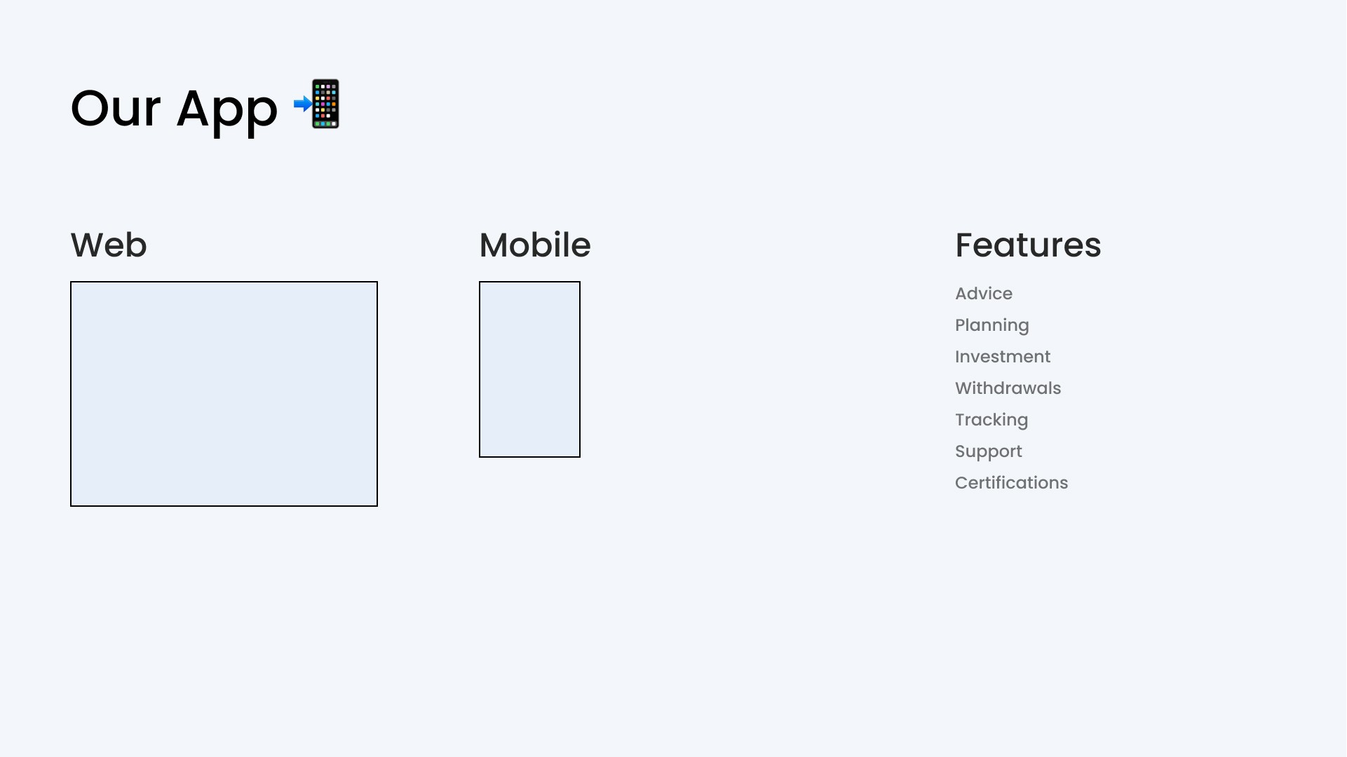
Fintual’s app plays a central role in this process as it must provide all the necessary functions to meet the needs of investors that a regular fund manager would offer.
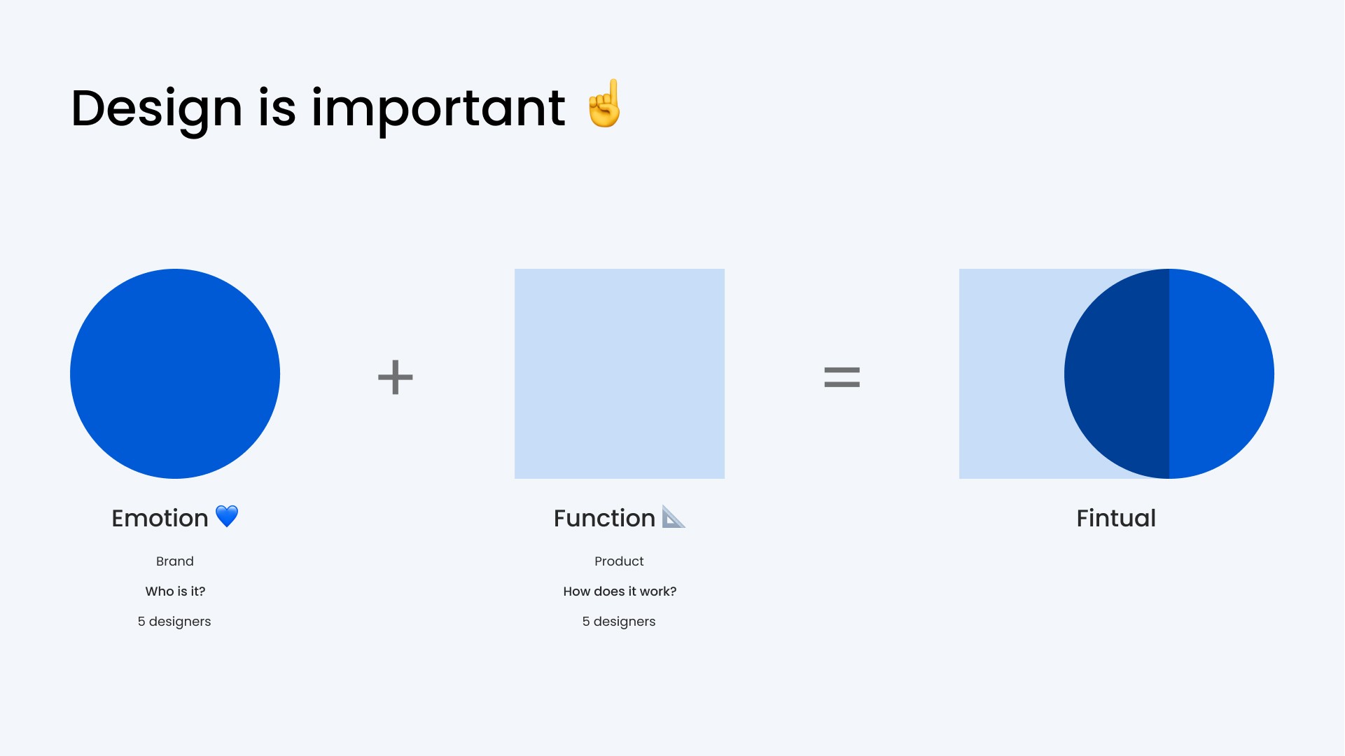
In this context, the design of the application becomes of fundamental importance. The app should not only be functional but should also provide an exceptional user experience. Interface design and brand identity are crucial aspects to ensure that the app meets these expectations.
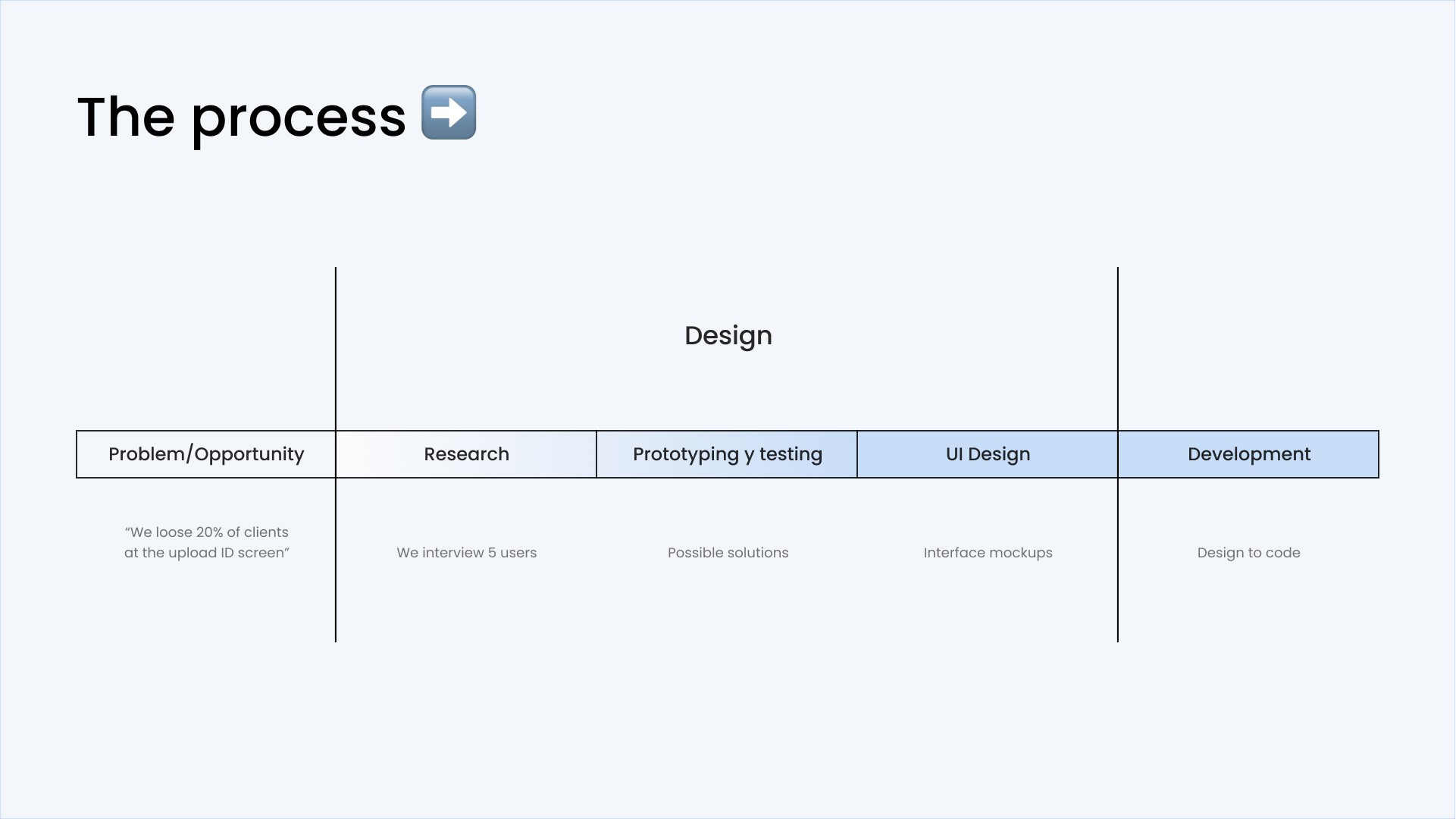
The product design process in this company follows a systematic approach. It begins by identifying problems or opportunities, often in response to user feedback or needs identified by the data team. From there, a research phase begins to better understand the problem and the needs of the users. Design iterations are established to perfect the solution.
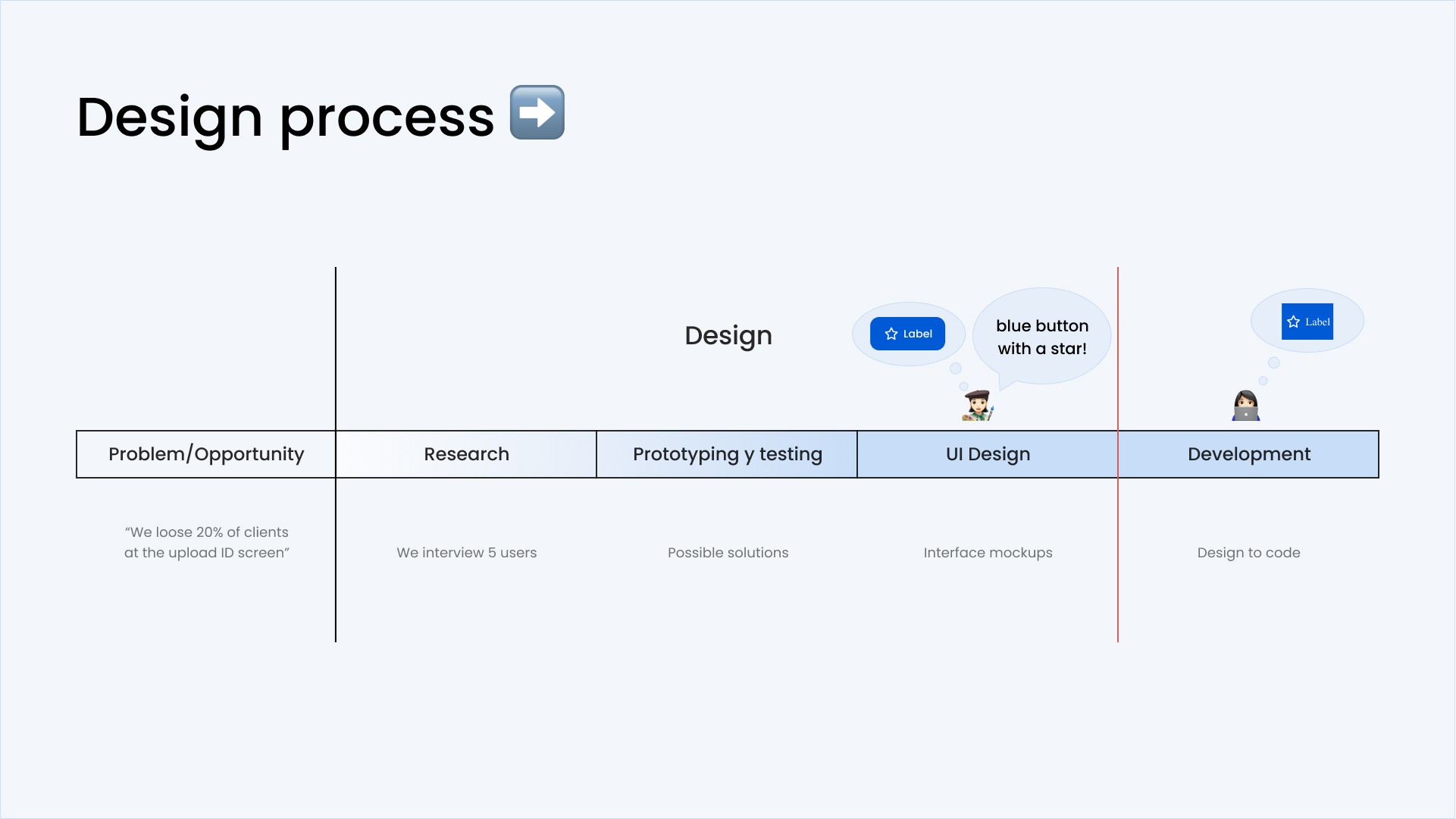
However, despite this meticulous approach, implementation sometimes presents challenges. Communication between designers and developers can be a point of friction. Designers may have a specific vision of what the interface should be, but this vision may not be accurately conveyed during implementation.
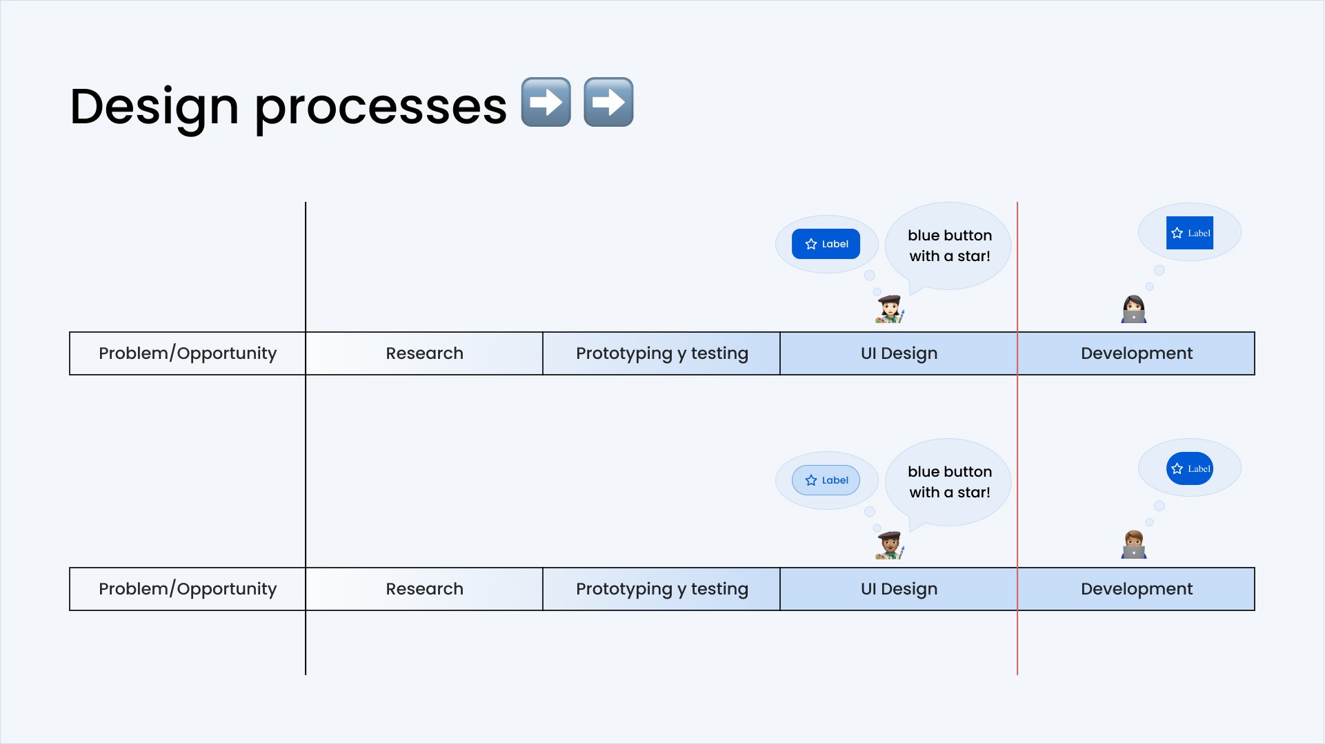
Additionally, when multiple designers work on the product, it is essential to maintain consistency in the design to maintain the brand identity.
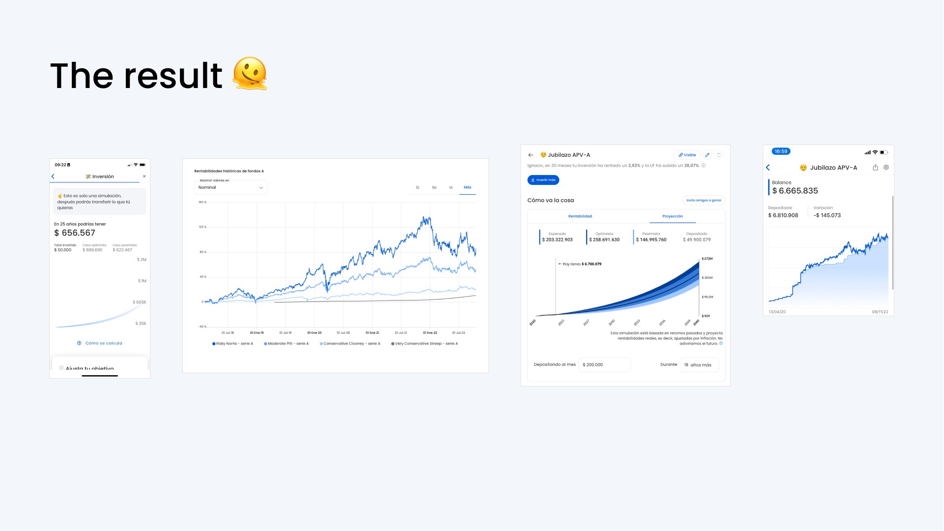
Although the results may seem similar, you can see in the details that they are different. Details like spacing, graphics, line weight, and if we add animations this only gets worse.
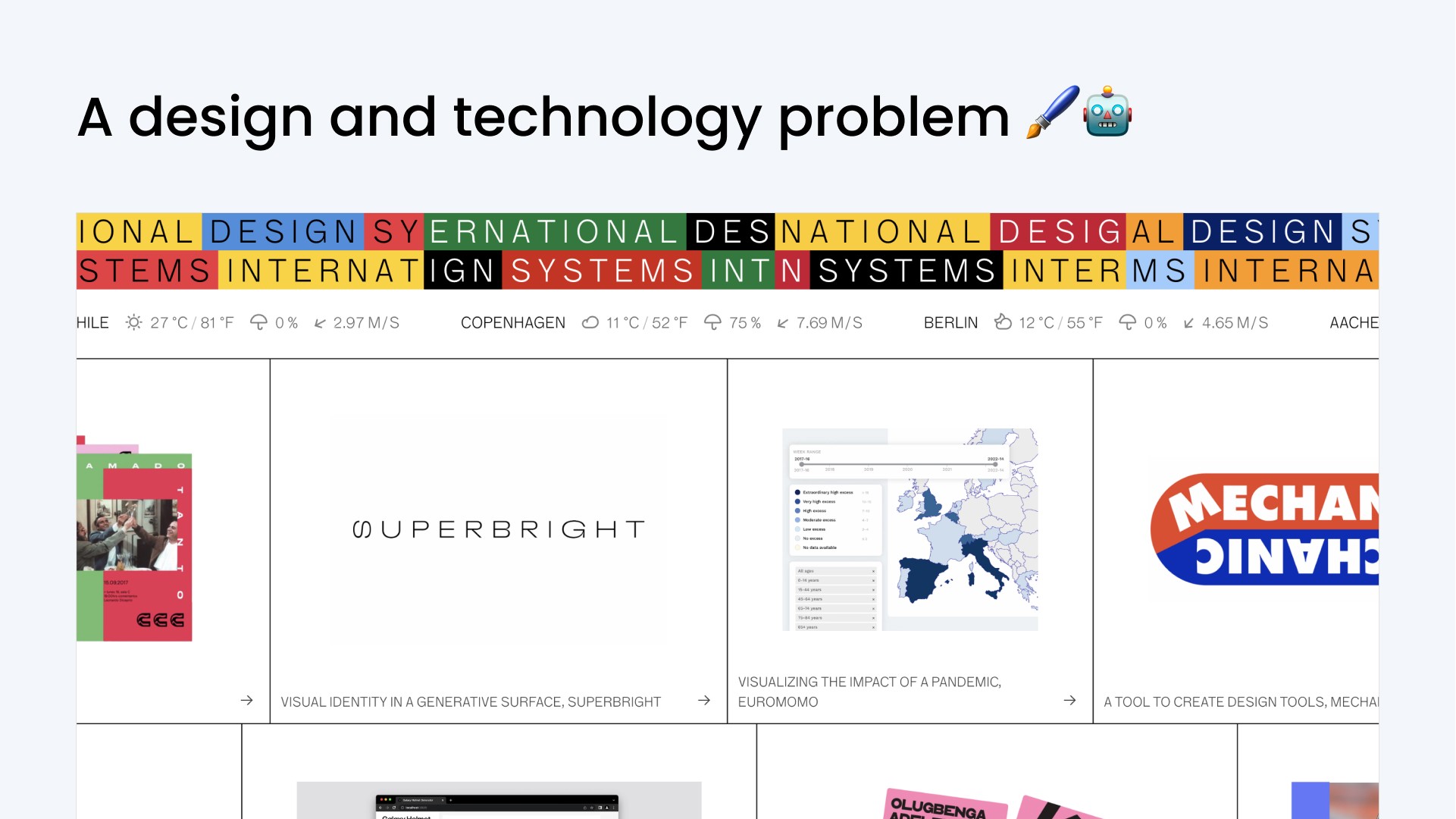
We realized that we had a design and implementation problem. We had been recommended to build our own design system, and that is why we began collaborating with Design Systems International to solve the communication challenges between designers and developers at Fintual.
[Martin] That's where we come in. Bare in mind, even though we call ourselves Design Systems International, we're not just about creating design systems. But, today we will talk to you about our collaboration in creating a design system for Fintual. The problem we detected is that a common language was needed between designers and developers, and even between designers.
We use the term ‘design system’ to describe a solution that the industry has denoted for the creation of applications and digital products. It is essentially a library of components that encompasses all the pieces necessary for building a digital application. It can be thought of as a set of elements with which all the possible interactions and features of an application could be built with. A prominent example is "Google Material Design", a design library widely known and used in the market. This library provides a generic set of components that can be adapted to build a variety of applications, not necessarily linked to Google.
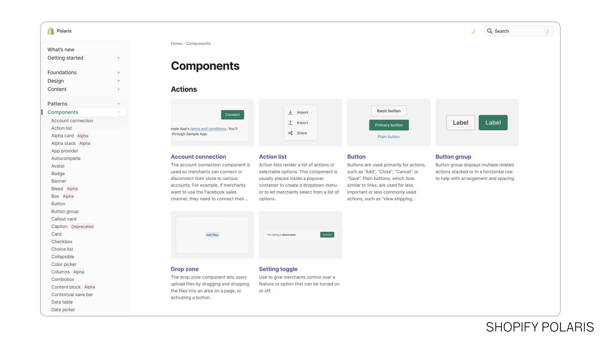
However, there are also organization-specific design systems, such as Shopify's. These systems are designed to encapsulate an organization's knowledge and visual identity into reusable pieces. The main advantage is that when applications are built using these systems, consistency in design and user experience is almost guaranteed.
In essence, a design system resembles a standardized set of building parts, such as bricks or modular furniture. It makes it easy to create consistent and efficient applications by providing reusable components. But it is also a way to organize the joint process of designing and implementing an application, which was also the point where they had issues at Fintual.
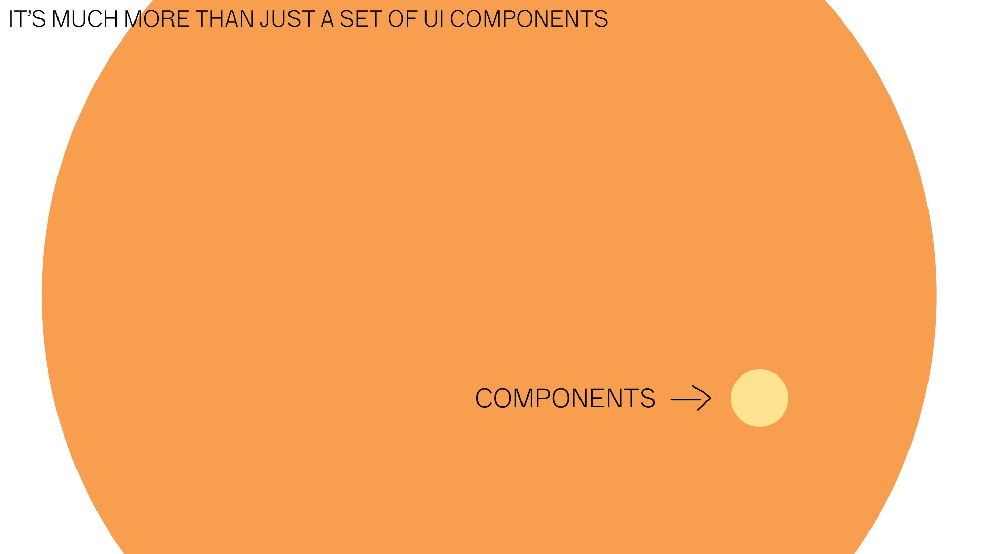
However, implementing a design system is a considerable challenge. It's not just about designing visual components; It also involves a combination of design and programming. And it requires a transformation in the way people work together: designers, developers and other collaborators must communicate and collaborate effectively.
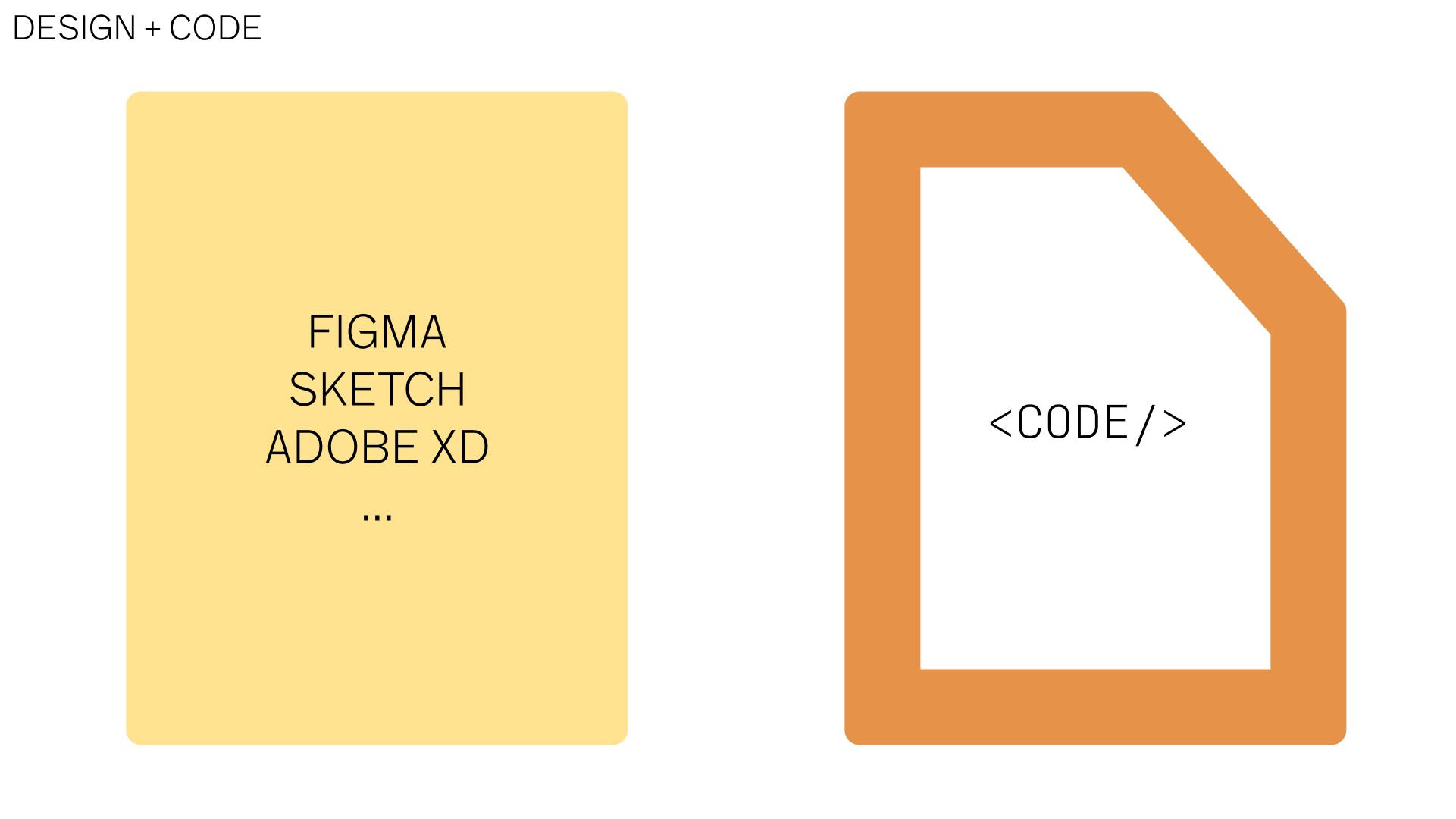
Additionally, it is important to note that not everything in the design of a digital application can be encapsulated in a design tool, such as Figma or Adobe apps. Some aspects, such as transitions, animations, specific interactions, and accessibility best practices, can only be expressed through code. Therefore, a Design System acts as a bridge between design tools and code implementations.
We set ourselves to create a design system. Not a generic one, but one that made sense for Fintual.
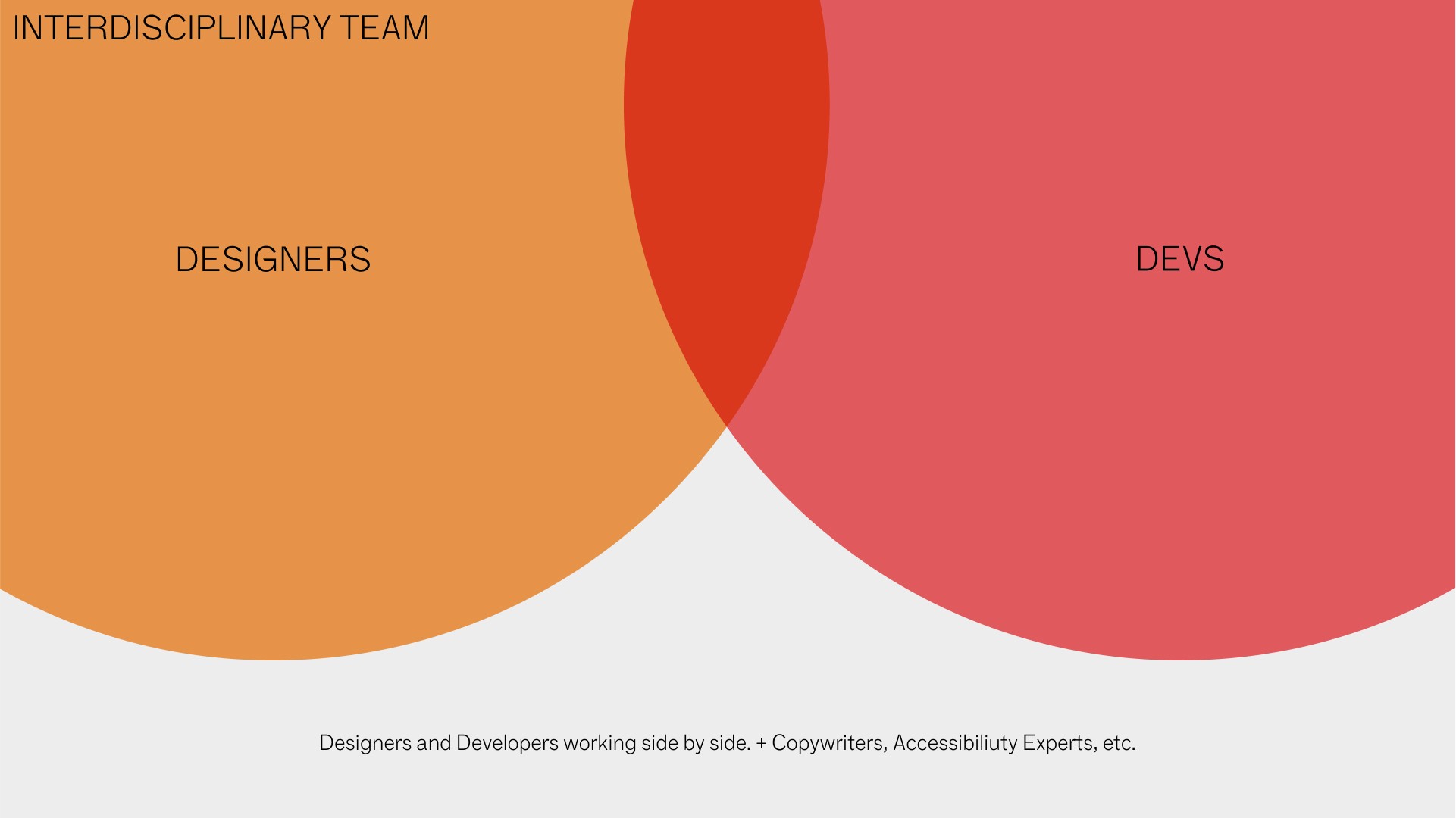
First of all, we needed to build a team that could see it through beyond its inception. Creating and maintaining a design system is not a one-time task, but rather an ongoing effort. Business and application needs evolve over time, requiring constant adjustments and updates. It requires an interdisciplinary team involving people from at least design and engineering, and hopefully also people that can move between both worlds.
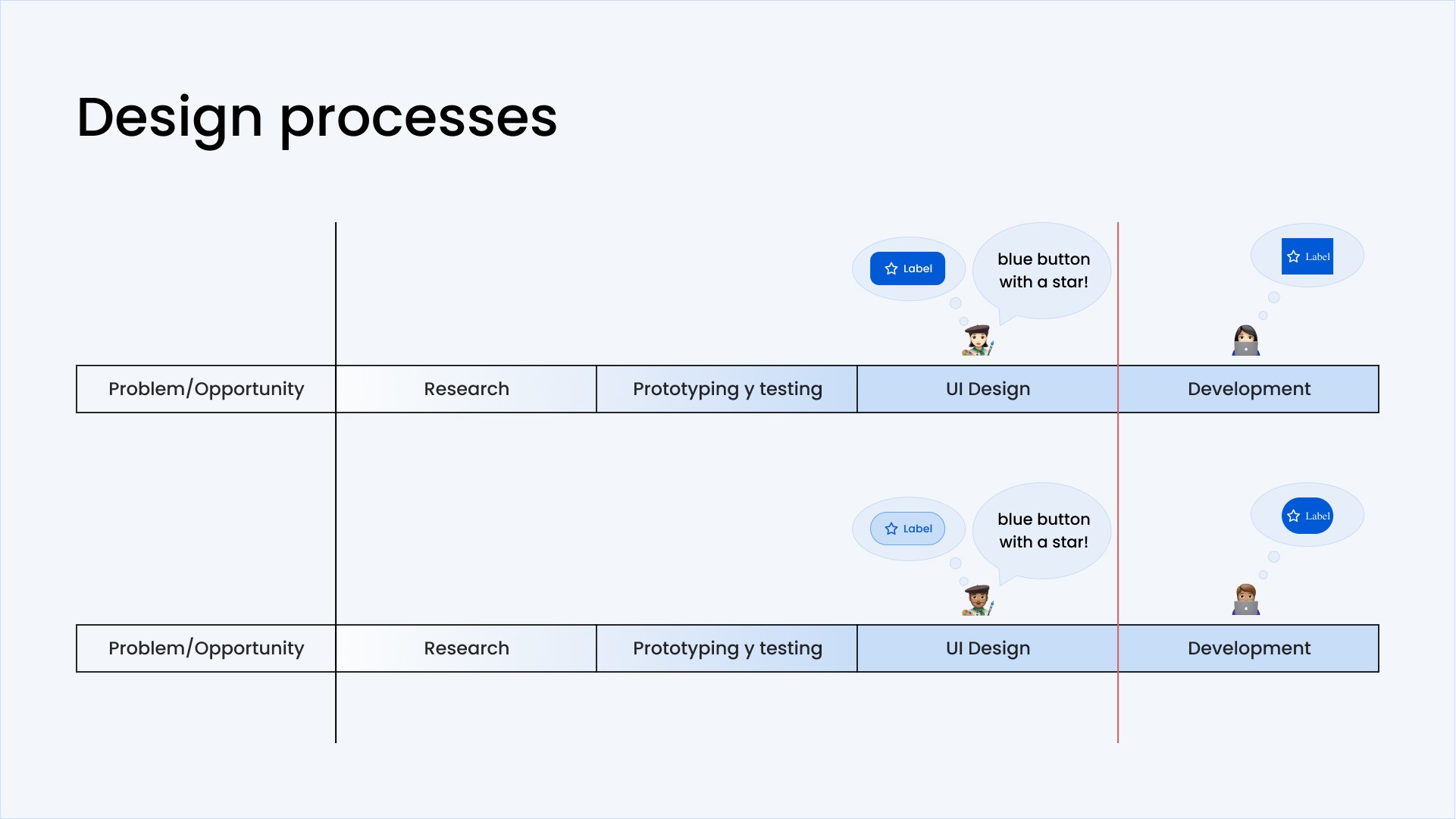
Let's take the design of a button as an example. In a traditional approach, every time a button is needed in an application, it is created from scratch, consuming valuable time and resources.
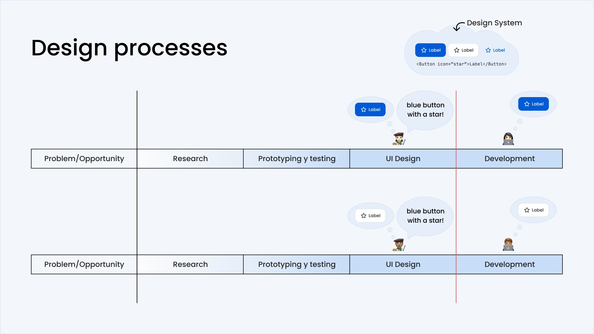
Instead, with a design system in place, interface elements such as buttons can be created quickly and consistently using predefined components. Since it only needs to be created once at the beginning, it can be done with greater attention to detail, knowing that the result will be reused multiple times.
Initially, adopting such a system may seem more laborious than traditional methods, as it requires defining and agreeing on how interface elements will be constructed. And it’s true, Fintual previously had tried to create its design system internally, but due to the effort it required, they had failed to take it to a point of broad adoption. So it became clear that they needed external help to lay the foundations and then help the entire organization to transform the way they were working.
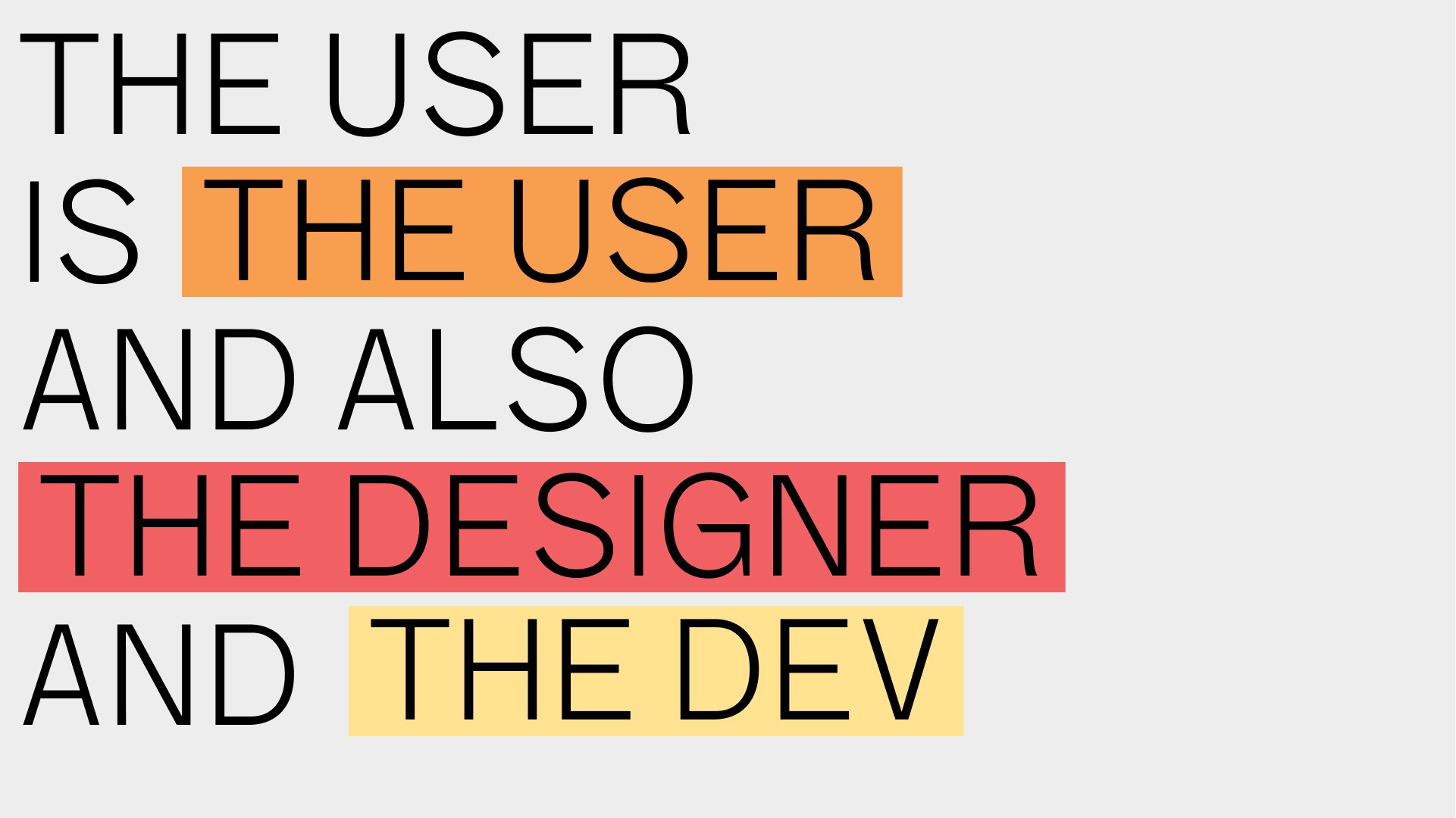
A key point to keep in mind is that the user of a design system is not only the end user of the application, but also the internal designers and developers who use it. When implemented correctly, a design system becomes a cornerstone that transforms the way an organization works.
A design system allows the most tedious and repetitive parts of the design and development process to be delegated to computers, freeing the human to focus on other tasks. It becomes a set of reusable digital bricks that speed up the creation of new functionality and allows design and product teams to focus on more creative and exciting aspects.
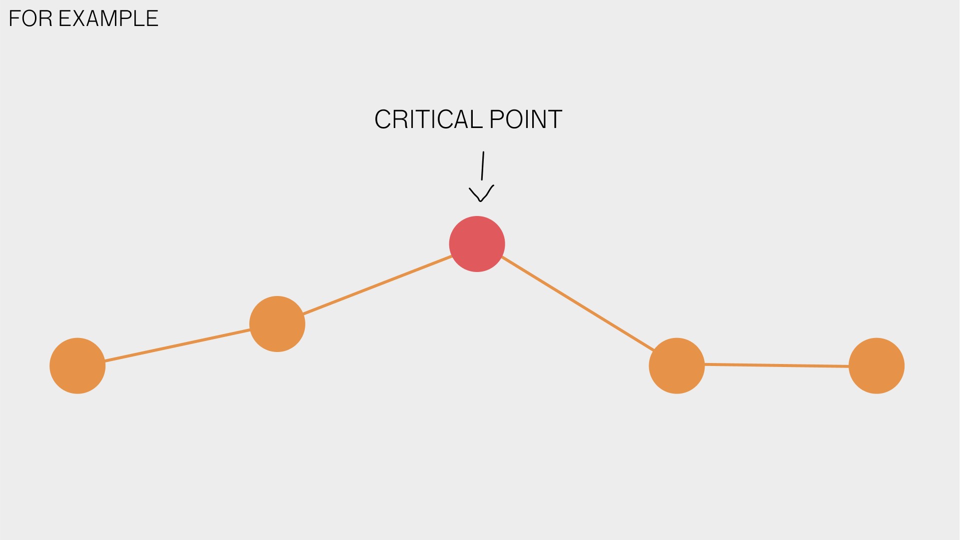
Thinking about another example: the development of a new application functionality.
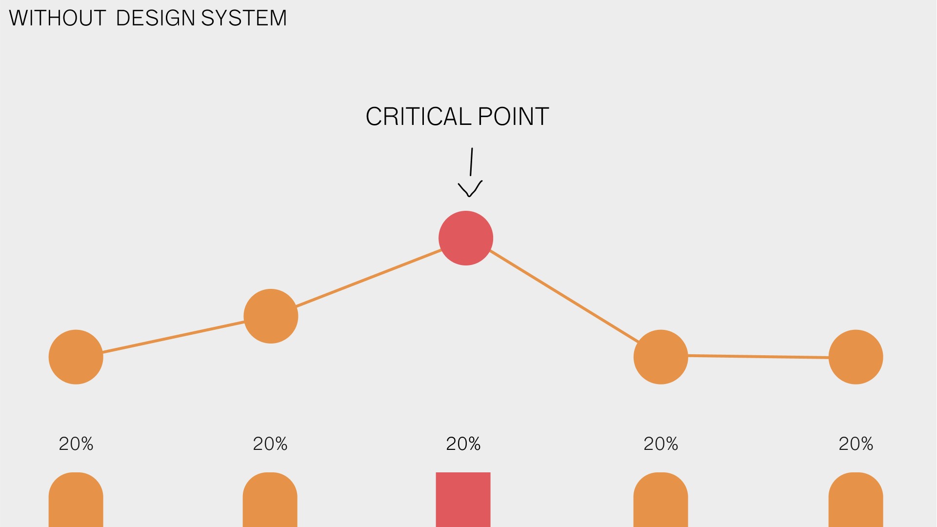
In a traditional system, the design and development of all parts of this functionality require the same effort, because they have to be created from scratch. So a critical point of the functionality requires the same effort as a very simple one, like filling out a name field.
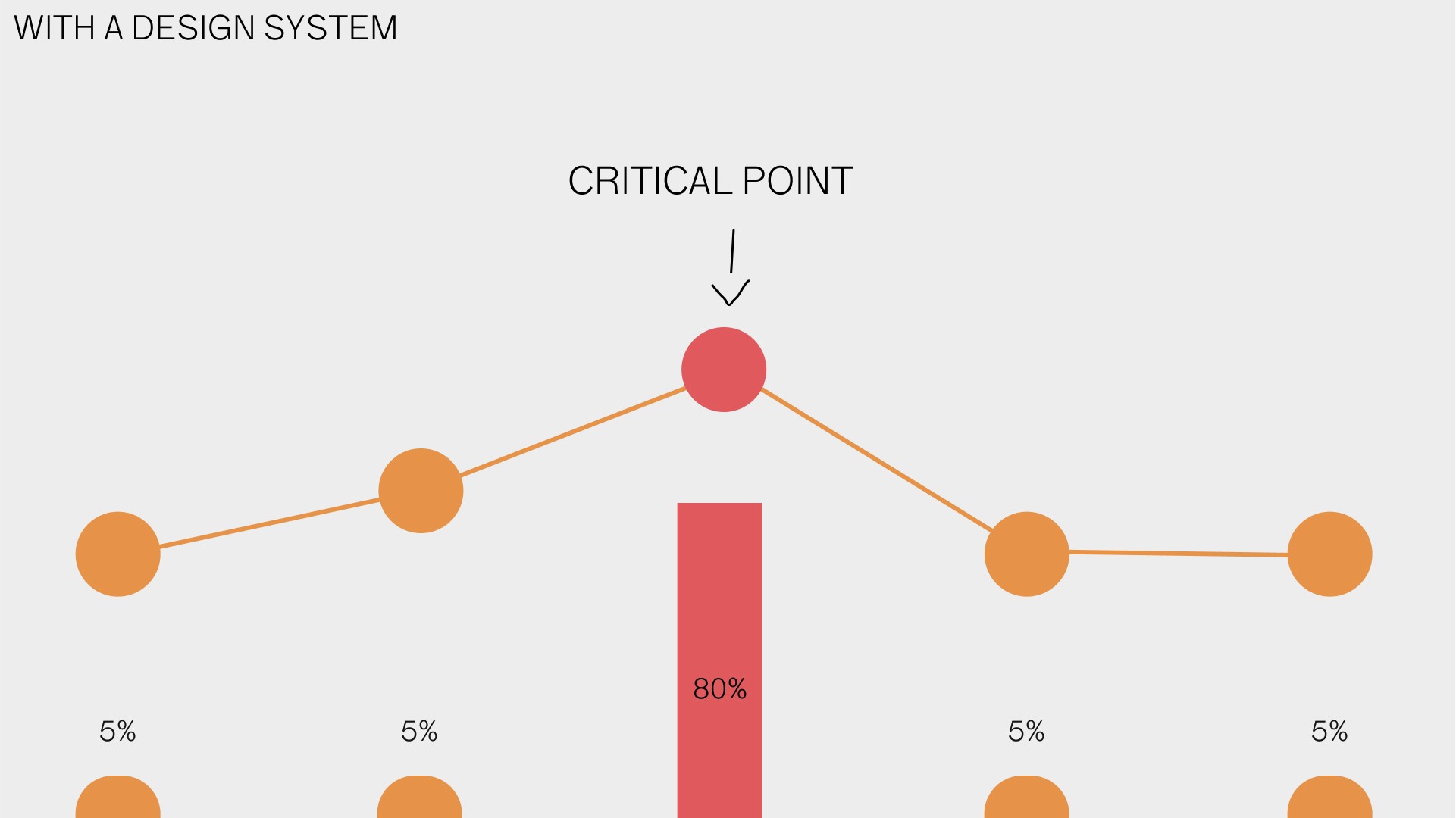
On the other hand, with a design system, all the simple steps require much less effort, and it is possible to put the most effort on critical points of the interaction.
So working with a design system allows development to be easier, faster and allows for more consistent results by default.
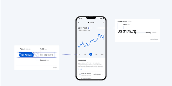
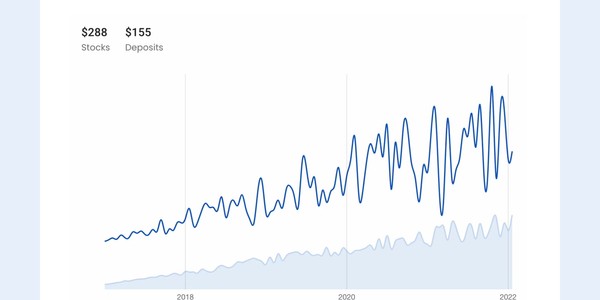
Here are some images of the result of this process creating the Fintual Design System.
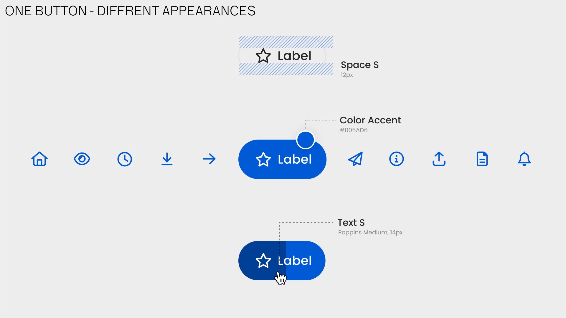
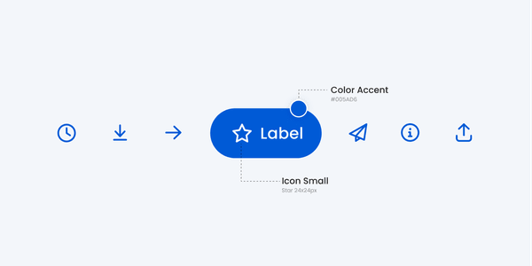
Here is the famous button. Created in conjunction with programmers and designers from Fintual, and also people from Design System International. They were defined with specific Fintual spacings, colors and variants for specific cases, including an animated variant for moments where the application needs to wait for a process to complete.
They were defined with specific Fintual spacings, colors and variants for specific moments. Also an animated button variant for moments where the application waits for a process to complete.
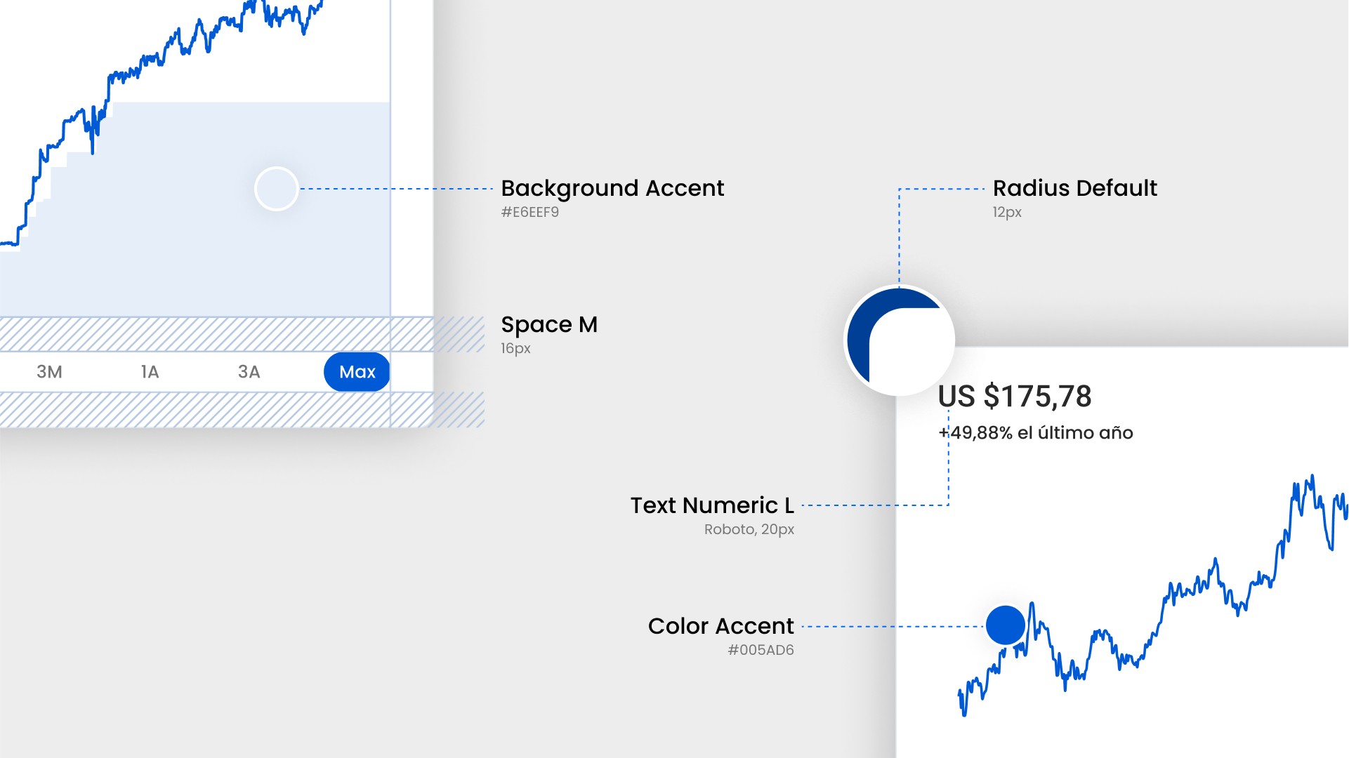
This type of thinking applies to all components: menus, selectors, number typography, etc...
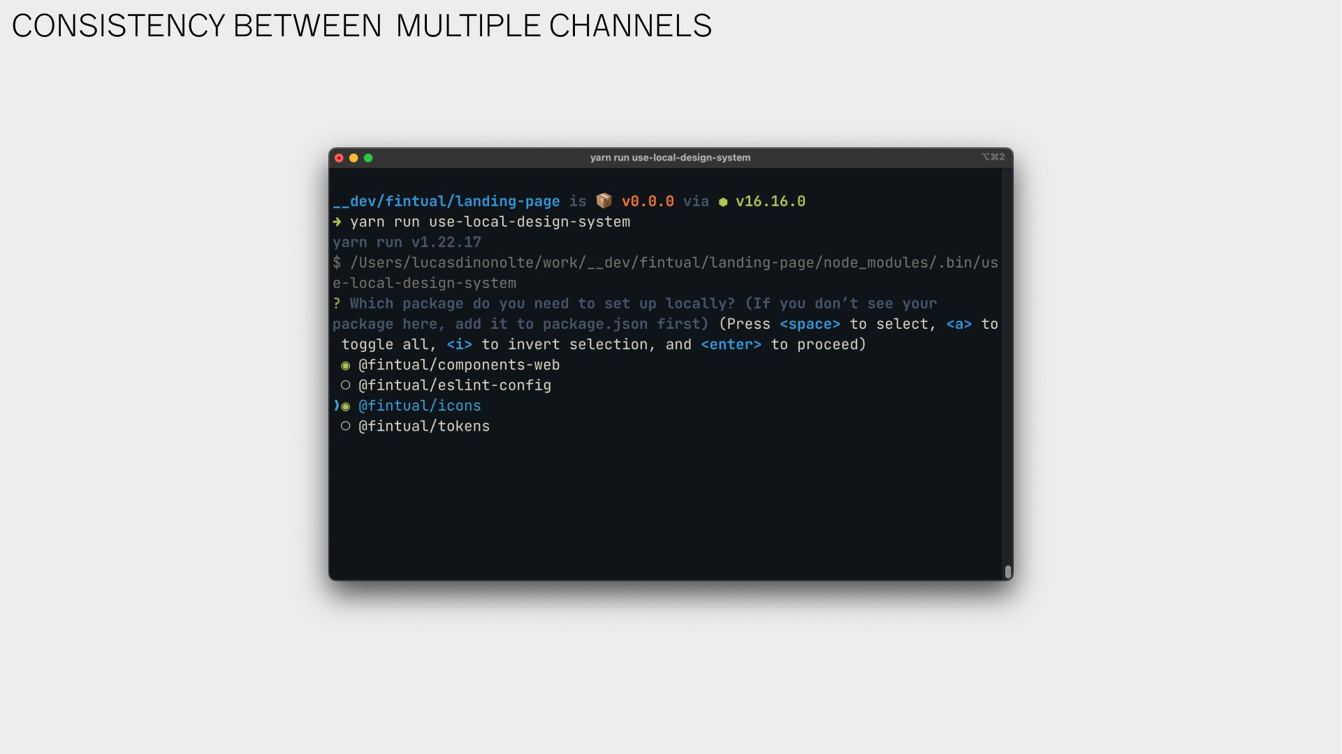
We also generated tools for developers to integrate this new way of working into their current configurations.
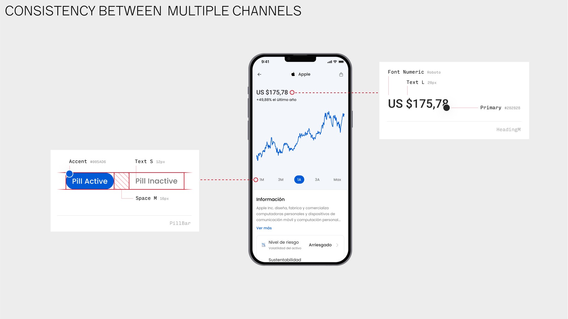
This project also introduced the opportunity for Fintual to create consistency between platforms: the web and the mobile application. This way a user wouldn’t feel much of a difference between using the mobile app and the web, since they were thought through together.
Another tangible result of this process is a tool like "Storybook", which provides a standard interface for exploring all the components available in the design library.
This tool allows any team member, be a designer, developer or anyone else, to understand and effectively use the available components to build coherent and attractive applications.
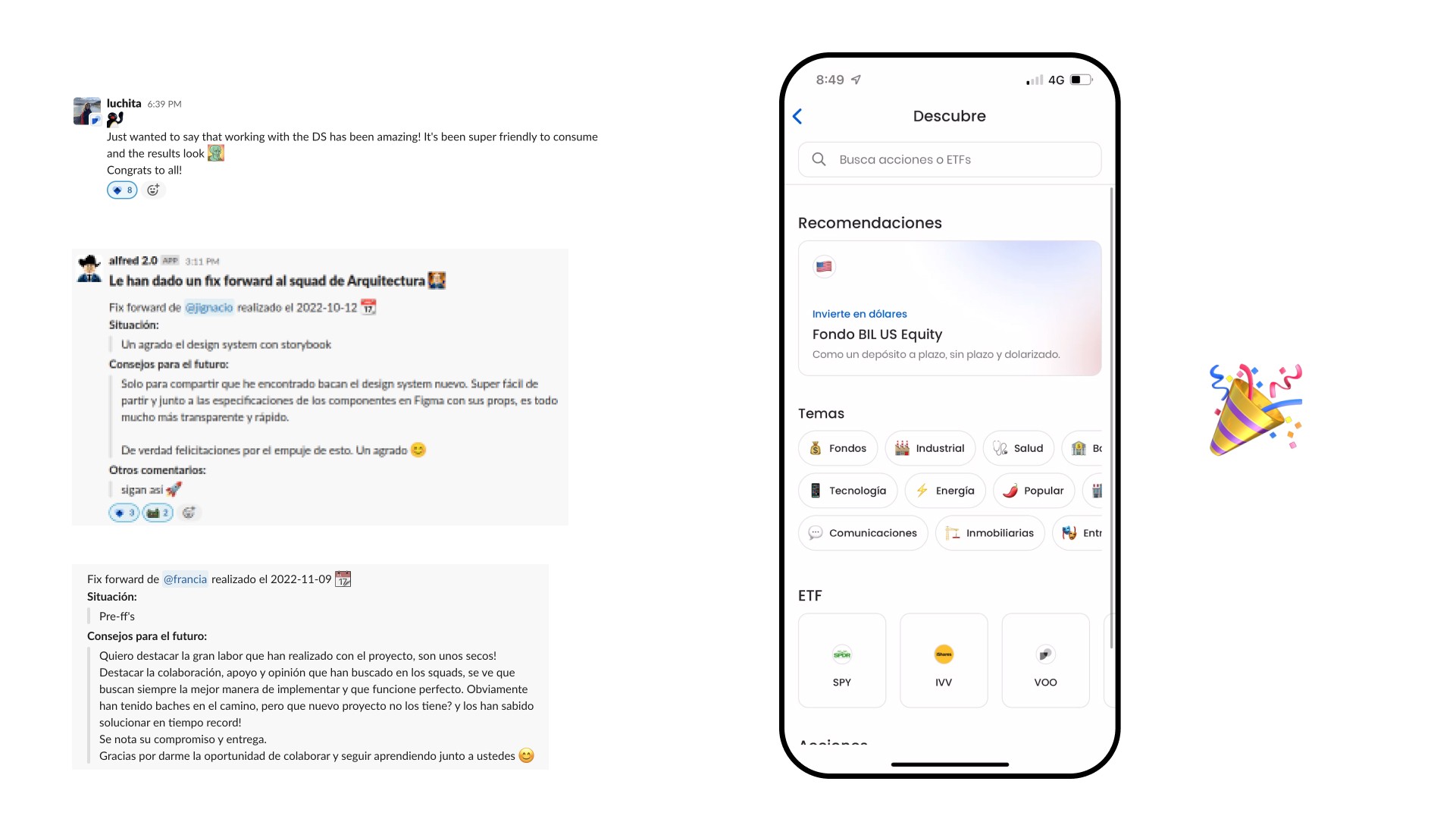
Other Fintual teams have recently started using the components, and we have received kudos for the effort put into them. Fintual is now getting started with the most difficult part, which is rebuilding the entire product with the new design system. But in parallel, new functionalities can be implemented from the beginning in this way, and the benefits can be enjoyed now.
Thank you so much!
