The ask
Cloudsmith is the only cloud-native, universal artifact management platform for securely developing and distributing software. In an industry replete with jargon and buzzwords, the SaaS company needed a new visual identity and systems-driven workflow to stand out, speed up production, and pave the way for future growth.
What we did
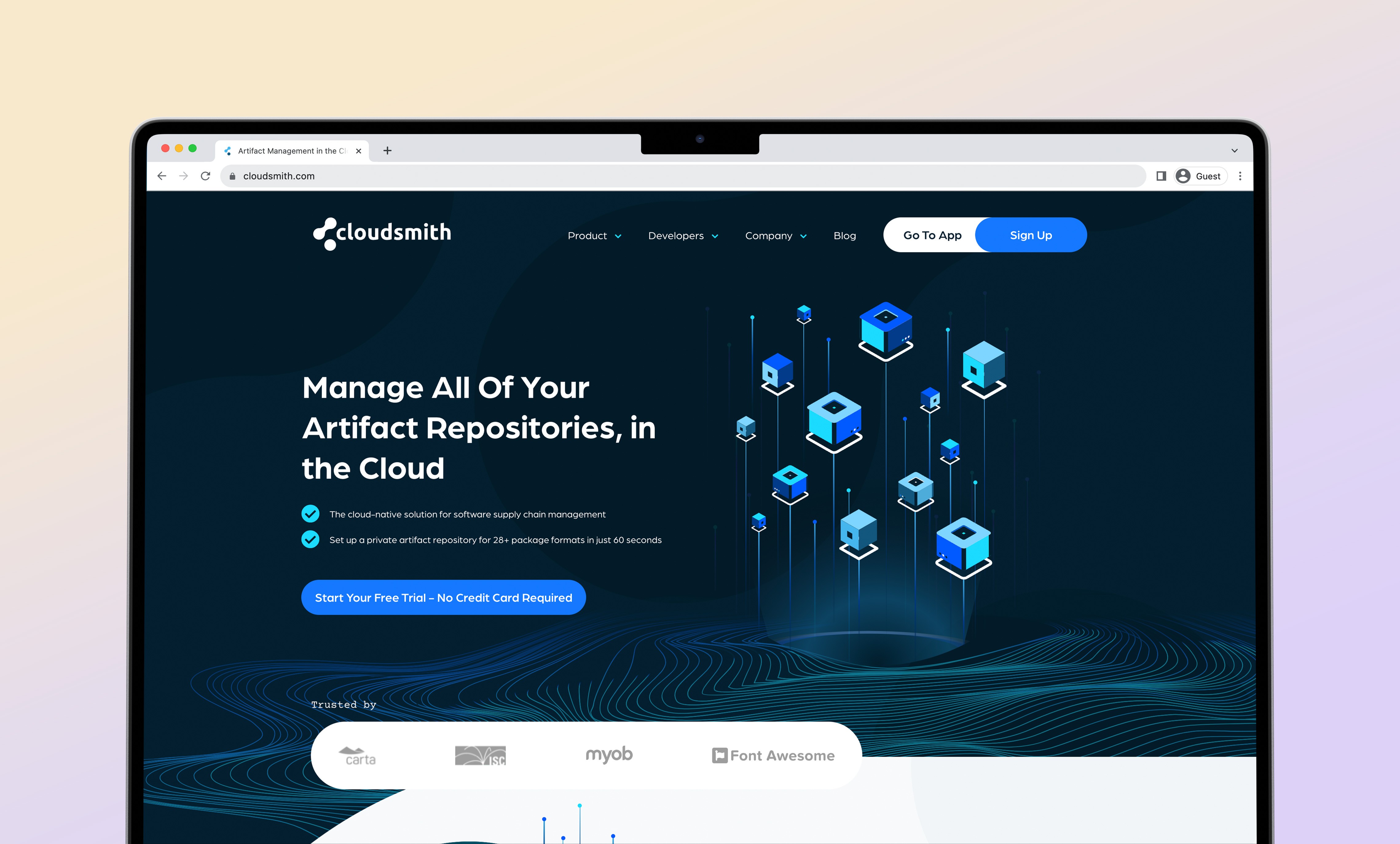
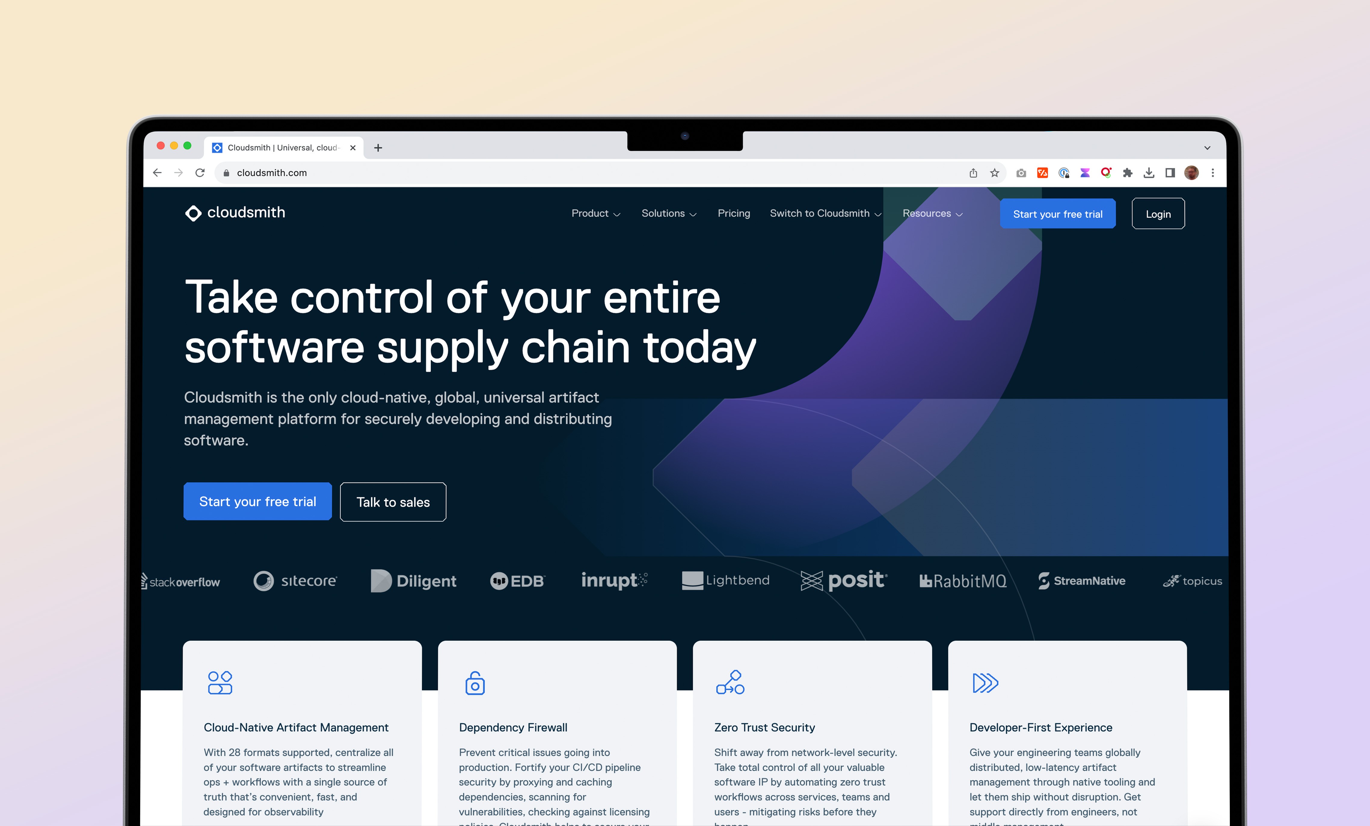
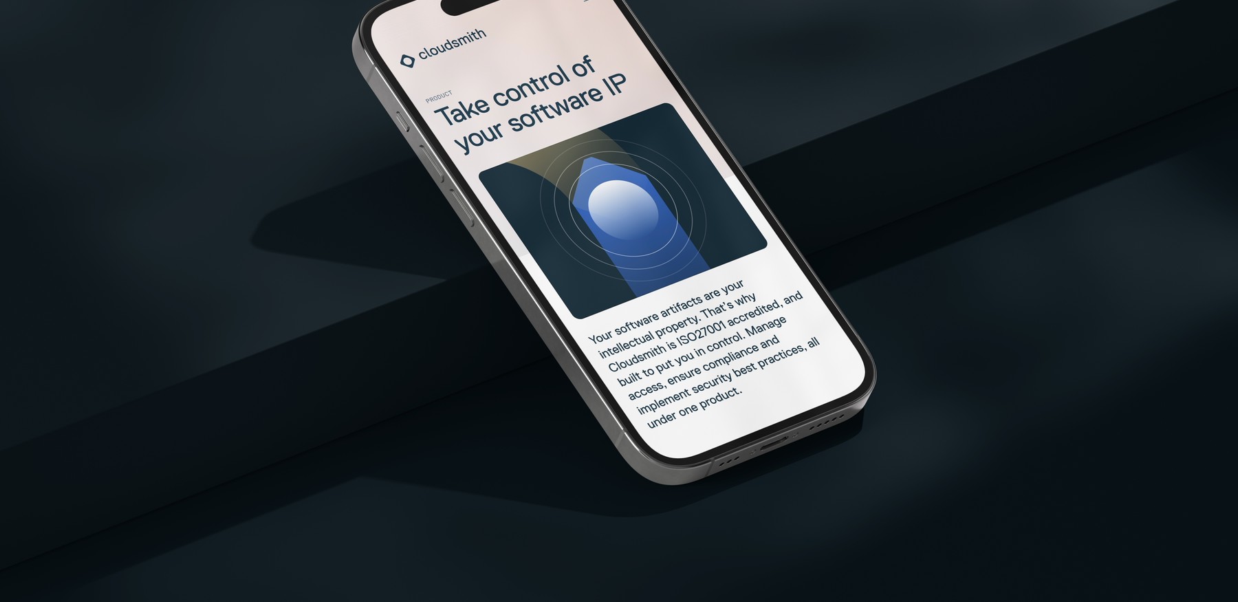
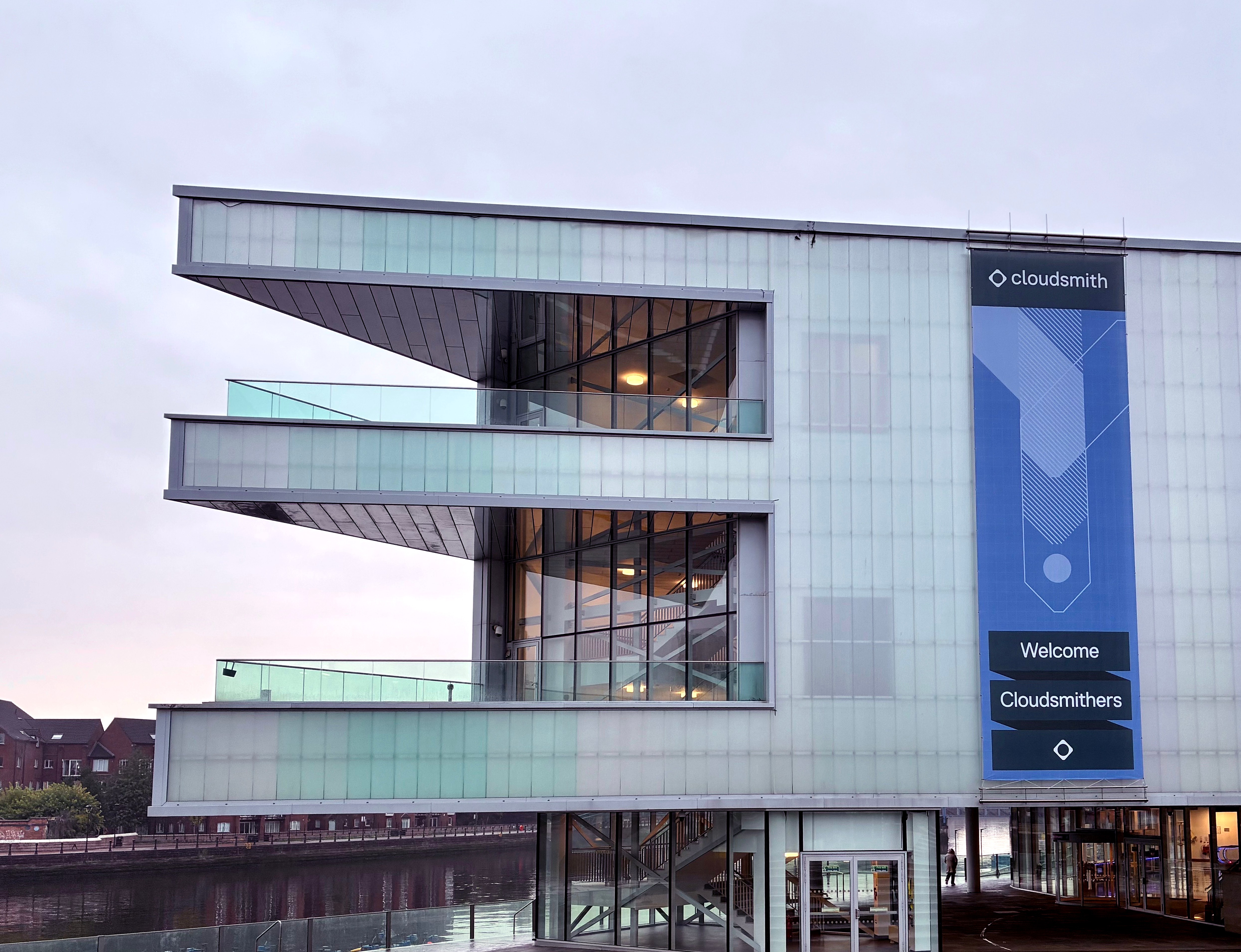
We worked with Cloudsmith to redefine their internal and external communications. The base of the work is a new visual identity with a dynamic illustration system composed of pipelines and packages that speaks to their core offering. We extended this identity to a foundational design system with an expansive set of modular components that allows Cloudsmith to compose new sections, pages, and microsites quickly and easily while maintaining a high level of quality in communications. The first application of this design system is their new website – cloudsmith.com – which was ready for a makeover after years of serving as their most important sales channel.
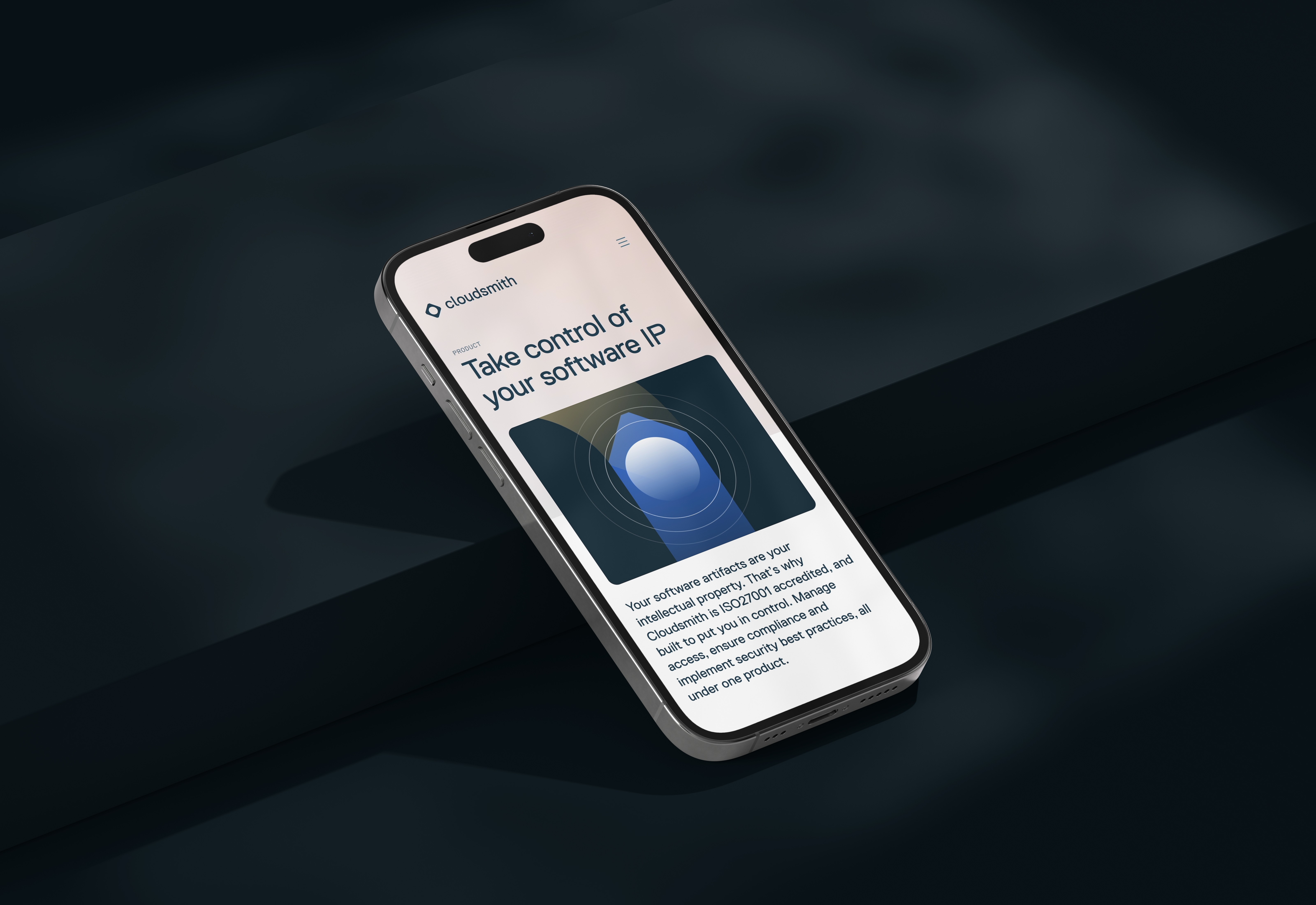
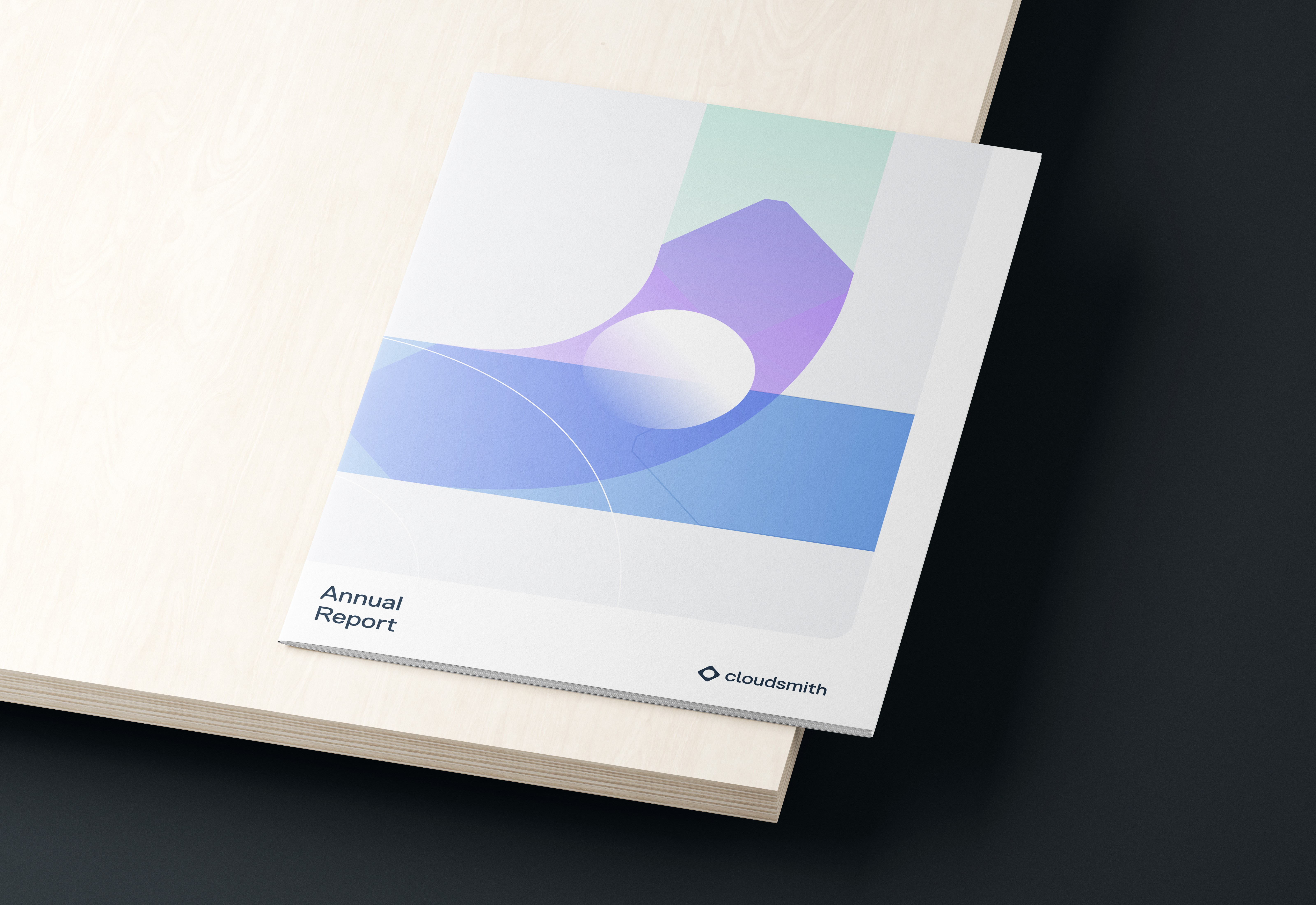
The new design system works not only on the outside but also on the inside. The website continues to evolve with over 1500 commits and 200 pull requests submitted accross the DSI and the Cloudsmith teams over the first few months – including entirely new features such as Cloudsmith Navigator and Cloudsmith Webinars. An accompanying set of illustration components makes it easy to compose on-brand animated graphics for now and in the future.
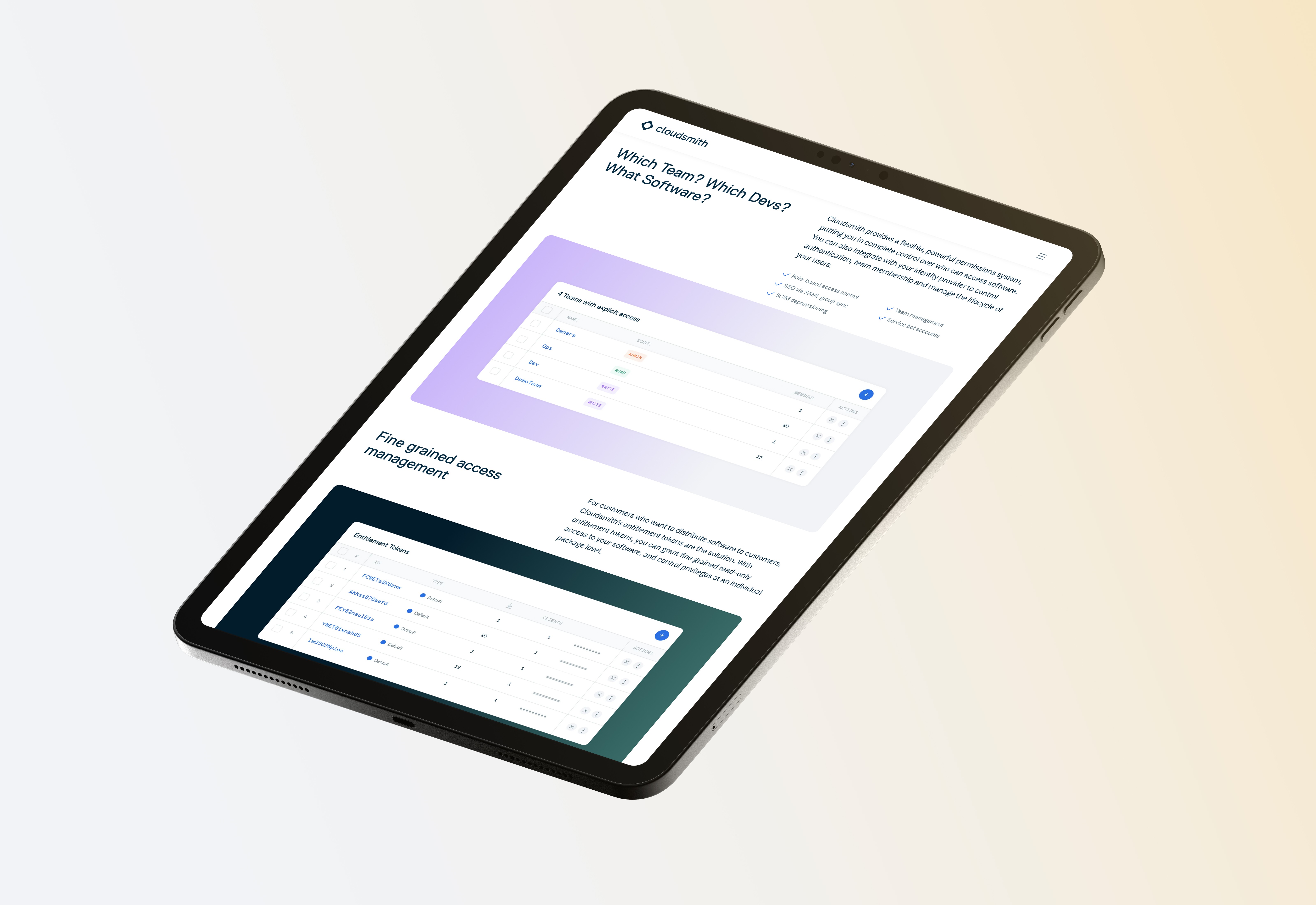
A light and clean layout makes complex topics around software artifact management feel approachable and easy.
Our Process
We worked with Cloudsmith over 14 weeks to release the new website, relying both on their internal research capabilities and our own research to ensure that the new application fulfilled a number of success metrics.
A core team of stakeholders were involved in all decisions, including choosing the new visual identity direction, the early interface designs, and the final user experience of cloudsmith.com. After the release of the website, we continue to work with Cloudsmith to optimize existing components and design new ones in order to grow traffic and conversion on the website.


Technical breakdown
The website consists of two main packages, the application itself and a set of design system components ready to be shared across other applications and microsites. The components are written in React, including the illustration system, which makes it easy to render custom SVG graphics whenever the need arises. These illustration components are consumed both by the website and by a custom design tool that wraps a user interface around the same concept and allows designers at Cloudsmith to easily generate graphics without worrying about colors, grid system, or other manual tasks. The website itself is a Next.js application that mixes static and dynamic rendering in order to create a super fast, edge-cached website with loads of dynamic features.
